graphic design

konektado at lamesa filipino kitchen

Toronto: Come dine (very well) for a good cause on Dec 2, 2013 at Lamesa. They have has begun an ongoing benefit dinner series called Konektado. The first guest chef collaborating with Chef Rudy will be Dennis Tay of Richmond Station, Keriwa Cafe and Top Chef Canada. Menu details to come. All donations will be going directly to a member of our community who's family was affected by the typhoon Haiyan/Yolanda. This dinner will be fantastic. Tell your friends and family. Don't miss this!  


I am love : 40

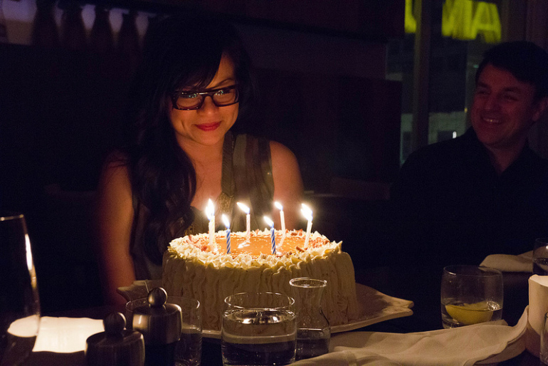
A belated post: My birthday this past April was something EXTRA special. I celebrated the big four-oh. What?! YES... be nice. I am still trying to get used to the idea! It was a celebration made more special by dear friends and family, spectacular food, an elegant setting and one amazing cake.

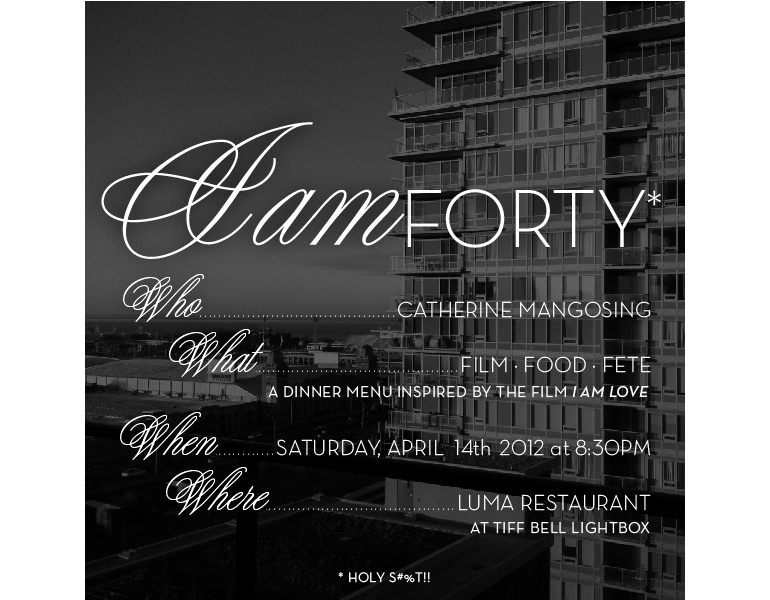
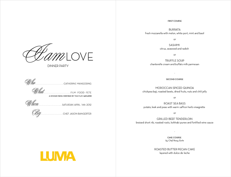
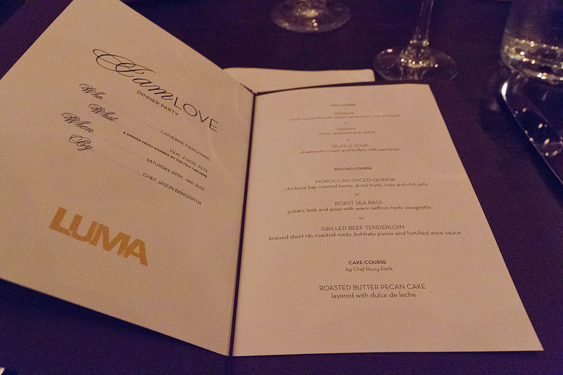
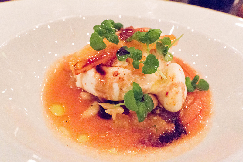
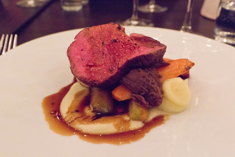
I decided to loosely theme the evening around one of my favourite films of all time, I Am Love. It is easily one of the most sumptuous films ever made. Food – and love – are central themes. I even designed my invites to look like the film's title sequence. If only I had Luca Barcellona as my calligrapher. Chef Jason Bangerter at LUMA created for me a beautiful menu around the themeIt was such an honour to have one of the best chefs in Canada to create such fantastic (and gorgeous) food for my birthday. If that wasn't amazing enough, my dear friend, Chef Rossy Earle created a jaw-dropping, Roasted Butter Pecan Cake with – get this – four layers of dulce de leche. 

It was one of my most special birthdays to date. It was such a beautiful night and exactly how I wanted to celebrate. I only wish my parents who have lived back in Manila for years and more of my dear friends in New York had been able to attend. Everything else fell into place and there was no shortage of laughter. What better way to bring in a new decade. So it's not so bad being grown up ...er, old. ;) 

Many thanks once again to all who shared the evening with me (including my friend Lee from NYC), Chef Jason Bangerter (and the great LUMA staff), Chef Rossy Earle for my amazing cake and Renée Suen for taking and sharing the photos. x 


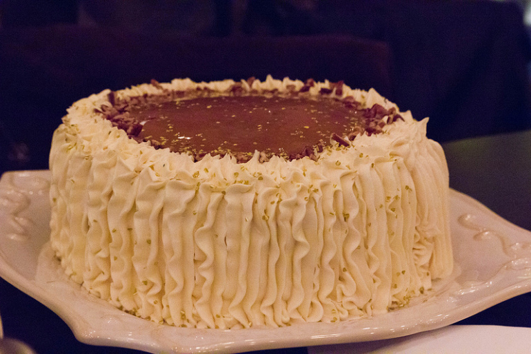
The AMAZING Roasted Butter Pecan cake with four layers of dulce de leche


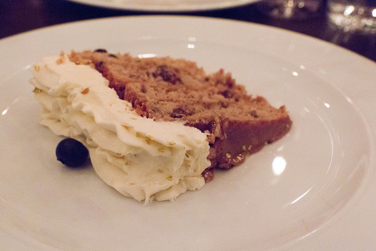
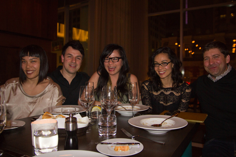
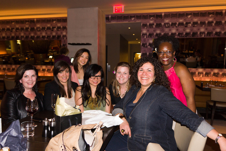
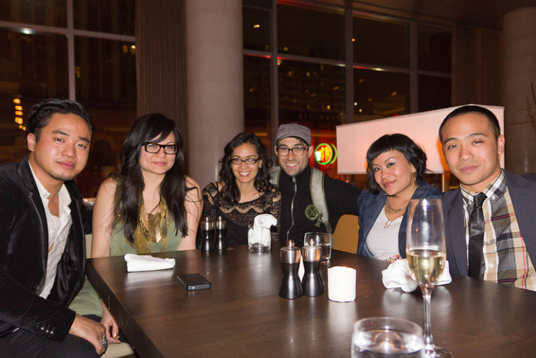
All photos above by Renee Suen

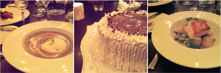
A few birthday Instagrams by family & friends' (including my own); left: the Truffle Soup with chanterelle cream and buffalo parmesan that we all LOVED beyond words, middle: my big, beautiful Dulce de Leche cake, right: perfect Roast Sea Bass

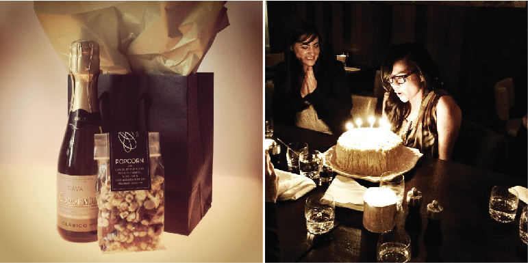
The gift bags for my guests included bubbly and popcorn with chocolate pop rocks, peanuts, caramel and Chef Jason's fragrant mix

the goodwin nyc : opens this week

I'm thrilled to announce that The Goodwin officially opens its doors this week. It's been an amazing project to have been part of. It's such a joy to see everything come together. A huge congratulations to owners Andre Jones, Richard Wise and the entire team!

The interiors by Larah Moravek look so fantastic. It's as gorgeous as down-to-earth gets. Warm and inviting. The space features beautifully custom-designed cozy baquettes. Larah also designed those divine lighting fixtures on the ceiling (in first photo) made from steel tubing. Materials from the original landmark building were repurposed as wood paneling for "The Grange" (back dining room/event space). Old license plates from the 30s and 40s that were found in the basement were used as wall decor. Even the buidling's old boiler tank was upcycled as a planter (seen through the back window). There was a high level of sensitivity to the building's rich history that remains in the new space. The interiors have an earthy, restrained elegance. It's been a great journey seeing all the sketches and swatches take form. It's been so exciting to take part in the design and work in tandem with such a talent.

Another reason to look forward to dining there is the menu prepared by Chef Colin Kruzic – formerly of James in Brooklyn and Bouley among others. The menus are currently available for download on The Goodwin splash page. Or if you are in New York City, definitely stop by. 

Here are a few photos below of the space (from today's Thrillist NYC write up). View a previous post on the branding/identity design development for The Goodwin here. The full website is coming soon. 

Photos above from Thrillist NYC


the goodwin nyc


Earlier this year, an immensely talented interior designer and friend, Larah Moravek, told me about a restaurant/bar project she was working on in New York. She asked to see whether I might be interested in working on the branding for it. The owners were also interested in working with me and I didn't even hesitate. This was the type of a project that I wanted to work on but don't often get a chance. Particularly, when I know the interior design is guaranteed to be fantastic.

The Goodwin will be located in a brownstone building on Hudson Street in the West Village and is slated to open next year. The interior space is currently being gut-renovated and reconfigured. I began the design process in July of this year. I first learned about the history behind the selection of the name. Apparently, the restaurant is located on land where there used to be a 300 acre tabacco farm. The name of the tabacco company was Goodwin & Co. This illustration below (an ad) was given to me by the owners as inspiration. The owners wanted to capture and essence of the location and name's history while making it modern. This is in line with the direction for the interior design of the space. 


I decided to do a lot more research, visually and otherwise, about the Goodwin & Co. I looked at typographic treatment, packaging design and layout of all the reference material I found from the same era. I also looked at cigar labels and loved the unique shapes they came in. I really wanted to capture the history while making it clean, modern and relevant. 

The client LOVED the result. They felt I had captured what they wanted right away. Needless to say, I was thrilled. We ended up on the 'crest' as well as a wordmark. I am about to start working on the stationery system, menu design, website, etc. So this is really just the beginning. I don't often share my own work here on my blog but this was one I am particularly excited about. The storefront window posters and awning have been installed as the construction continues so I am now finally able to share this work. I will post more results later in the process! Also view this project in my portfolio identity case studies


sarahcentricity & serendipity

There is no one else in this world – apart from Sarah Jackson – that I can call all of the following: Twitter friend, tenant, penpal-of-sorts and CLIENT. Let me explain. At some point, there were mutual Twitter follows. Then some Twitter conversations (and a lot of remote, simultaneous laughter). Which lead to an almost-ladies-drinks-at-the-Ace-Hotel between Sarah, my friend Nichole of Little Brown Pen and myself. It was foiled at the last minute by a scheduling conflict. Then Sarah jetted off to Australia and New Zealand for five months. Shortly thereafter, I moved to Toronto. Then one day she contacted me via email (as I was reeling from a potential tenant flaking out on moving into my Brooklyn apartment). She asked me whether my apartment happen to still be available because HER sublet situation fell through. Then, Voila! Sarah becomes a tenant in my Brooklyn apartment for a few of months. For those who may not know her, Sarah Jackson is an über talent: a writer, producer and creative director. She is also HILARIOUS, great looking, highly ambitious and smart. Whilst she was my tenant, we wrote many epic emails to each other about a myriad of interesting topics. Fast forward to now. She's back in Australia. Our emails back and forth continue. She ended up hiring me to redesign her blog as well as her work/portfolio website. Both were recently launched. This is a modern day, Twitter-born, multi-faceted relationship. Needless to say, Sarah and I will HAVE to now meet in person one day. And there's no telling where in the world we might do so. That's the most amazing part of all.

a seduction in letterpress


That's it. I'm hooked on letterpress. I have been mildly obsessed with the dark grey + gold colour combination for the past couple of years. It seemed only natural that it end up on my new business cards. The gold ink stamped onto flannel-like paper is so seductive. After investigating my options, @letterpresslove came back with the best quote and swift customer service. Aptly, named, don't you think? 

The specs are as follows 
Paper: French Paper Co., Dur-O-tone in Steel Grey, 100 lb. cover weight
Ink: Pantone 874 (house gold), 2 hits
Size: 1.5H x 3W (inches)

Thanks so much to Amy for the letterpress printer recommendation!

myturtleneck air

I knew my recent move to Toronto would involve re-establishing a new network. Not a small feat (and one that I know will take some time). As I continue to work on projects for New York clients, I knew I had to come up with a way to also introduce myself to the best of the best of the Toronto design community. It had to be a self-promotion package that commanded a little more attention than just another email. It was important that it to express not only my abilities but also my sense of humour. The photos below are the result. I had SO MUCH FUN creating this. Amazingly, I was also able to find a digital printer (in the U.S.) that also had the capability to do die-cuts (and perforations!) in smaller quantities. A big thank you to everyone that helped me through this process. 

Do you like?


toronto subway signage : name that typeface

Unlike New York's subway system (set in Helvetica, of course), Toronto's subway system signage is set in a typeface very similar to one of my personal favourites: Neutra. It possesses the same mid-century modern qualities but it's not identical. For instance; the bottom strokes (aka legs) of the letterforms are different – they don't finish off flush to the baseline the way Neutra's does. Anyone know the name of it? 


rare find : philippine cigarette labels (1800-1900)

It is so rare to find vintage packaging design from the Philippines so I was thrilled to stumble on these. This extensive collection of cigarette pack labels are from the late 1800s to the mid 1900s. For those who are not aware, Spain colonized the Philippines for about 400 years (until towards the end of the 1900s). So most of the packaging text is in Spanish. I love this collection :) I wish I knew the story of who collected and documented these. There are more here if you're curious.


All images from Firma.com.ph

inspired : shadow box art

It's been quite a while since I've been inspired (nor have had time) to hand craft anyone a gift. What started out as an idea for a greeting card turned into shadow box art. I didn't think to document the finished piece until I wrote yesterday's post on The Nabokov Collection.

To give you a bit of a background: I wanted to create something meaningful for a friend who recently had a birthday and had just returned from a big sailing trip to remote islands in the Bahamas. He came back lamenting being back in the city, missing the peace and beauty of being on a sailboat, far away from his laptop, civilization and everyday stress. He showed me a map of his sailing route and details of his recent adventure.

An idea started to form. Initially, it was going to be a simple hand made birthday card. Then I remembered that I have hidden in a cupboard, some sand and sea water I saved in a water bottle from my last beach trip to the Philippines. I searched online for images of old maps of the same area (older maps are just more beautiful than new ones). I found a silhouette of a sailboat and included his initial on the sail. I found a vial-like-bottle to contain the sand and sea water. The last element was a tag with an image of the Caribbean Ocean (one of mine from a previous trip to Mexico) on one side and a message on the other. I was thinking of this as a kind of "In Case of Emergency" box that would normally hold a fire extinguisher. The message instead reads: IN CASE OF A SEA DEPRAVATION EMERGENCY OPEN JAR.

I really enjoyed the whole process and asked myself: Why I don't do this more? Good things can come out of a limited budget with a little inspiration. Below are photos of the finished piece. I hope this would remind him of his trip and that a little piece of it would always be within reach.


the nabokov collection


John Gall of The Design Observer asked a group of well-known graphic designers (like Chip Kidd and Michael Bierut) to design their own version of a Nabokov book cover within a specimen box (entitled The Nabokov Collection). Apparently, Nabokov was an avid butterfly collector. Great concept and beautiful work. See the rest of the collection here.
This reminds me to photograph a very recent personal project I did (as a gift). That I will show next...


All images via The Design Observer